Per Lei: Swedish beauty brand identity
The Swedish beauty brand Per Lei (“For her” in italian) sells it’s own line of mascara and related products and needed an identity that makes them stand out from the competition.
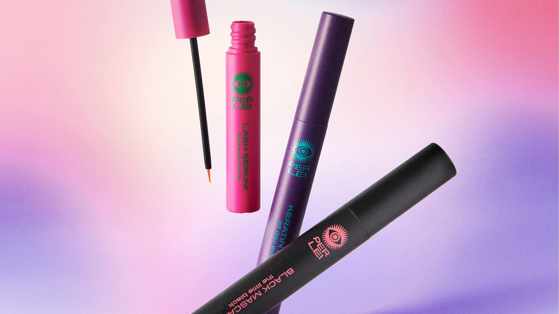
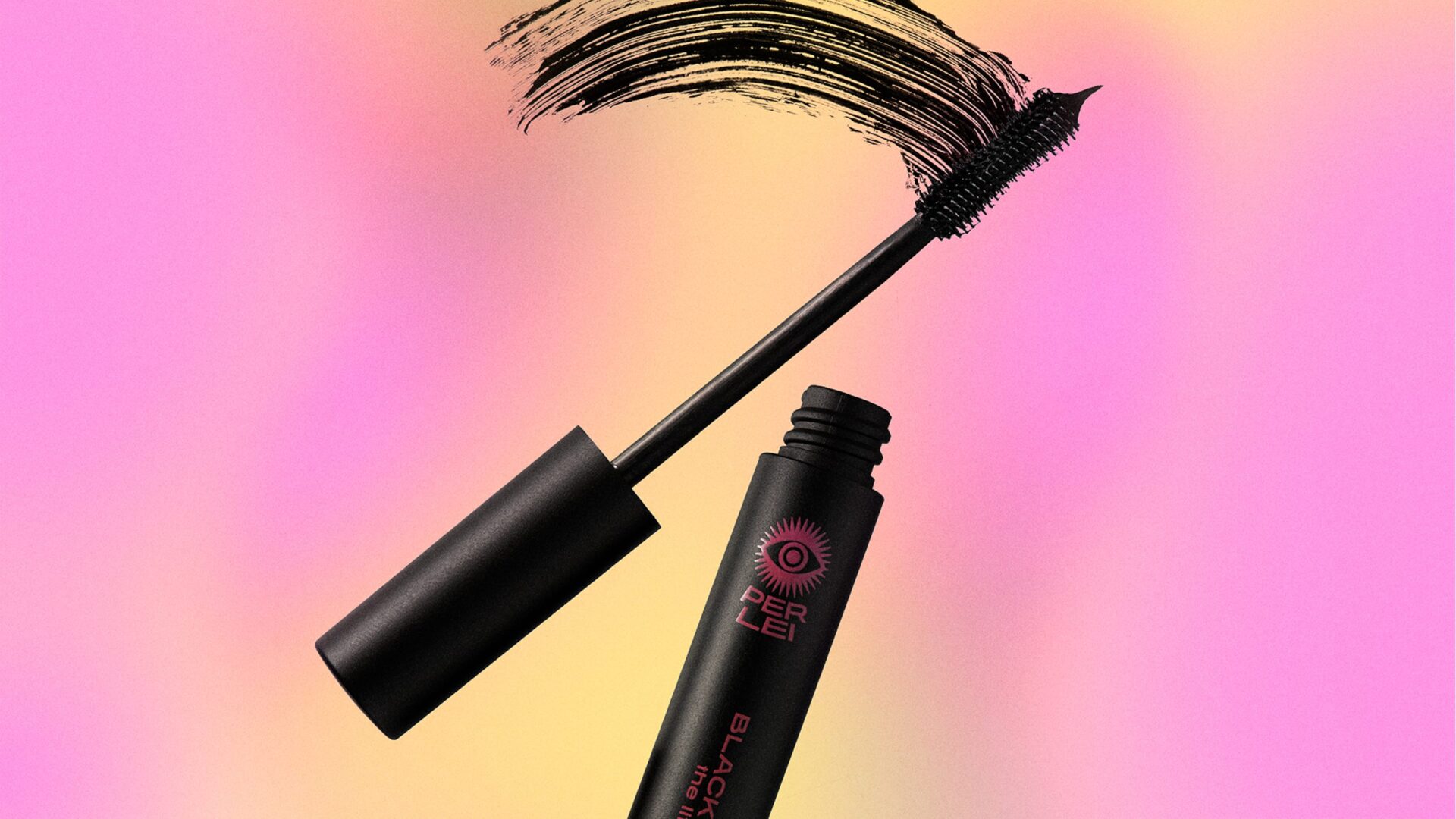
The packaging and communication for Per Lei is more colorful than the competition and the eye makes it very visible.
In the beauty business most brands use the same expression. Classic design often using gold, silver, black and white. This creates a sea of sameness on store shelves where products blend together.
Colorful gradient backgrounds gives good contrast to the Per Lei products.
We wanted to do something different and created a more colorful and expressive brand with a very distinct radiating eye symbol. The eye connects directly to the product category (mascara, lashes) while the radiating lines create energy and draw attention. It’s impossible to miss on a shelf full of muted luxury packaging.
Glauser Creative created the brand, identity, ecommerce design and packaging enabling the founders to get their first customers. Read more on their website.