Graphic identity and logotype for change management
Changement started in 2004 by Anna Morin, an interim management consultant. She helps organisations change for real.
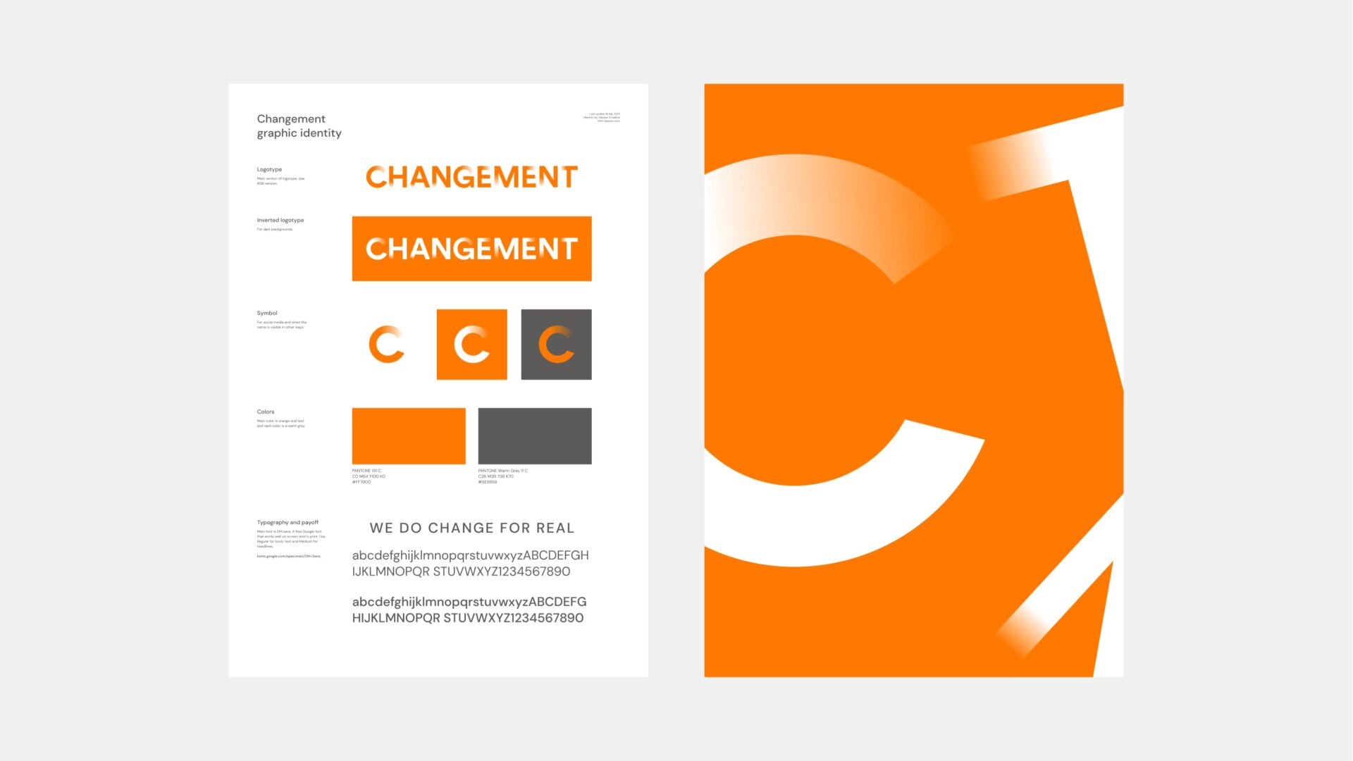
The letters of Changement fade into view creating a moving logo. The C symbol resembles a loading spinner in action.
The fading letters visualize the transformation process central to change management. Elements transition from one state to another. The circular C symbol, reminiscent of a loading indicator, reflects the ongoing, iterative nature of organizational change. Change is never truly complete; it’s a continuous process.
The identity extends across business stationery, presentation templates, and digital communications. All the touchpoints an interim management consultant needs to appear professional and trustworthy.
Glauser Creative helped Changement with a new logotype and graphic identity.