Designing the Greenely energy app using AI
Greenely is a Swedish energy company helping households save money on electricity through smart optimization.
Their app connects to your electric car, heat pump, and other devices, using 15-minute spot prices to charge and heat when electricity is cheapest.
They brought me in to support a rebranding project that evolved into something much bigger. It also became my first commercial case where I contributed not just design, but actual code.
Supporting the rebrand
Greenely was working on a new visual identity. I came in to support that process, helping shape a look and feel that communicated innovation, sustainability, and simplicity.
The goal was a brand that felt modern and trustworthy. Something that could stand out in the energy sector while still feeling approachable to everyday users trying to understand their electricity costs.
My main role came next: taking that new brand and bringing it to life in the app.
Redesigning the app experience
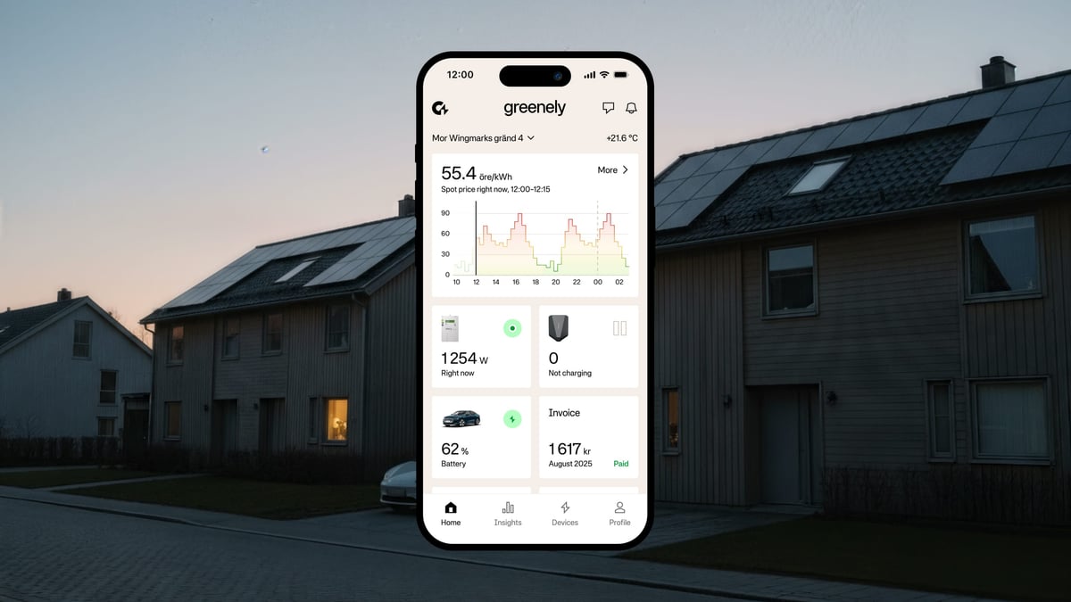
With the brand direction set, we moved into the app. I designed a completely new home view that puts the most important information front and center. Users can see at a glance when electricity is cheap, how much they’re saving, and what their connected devices are doing.

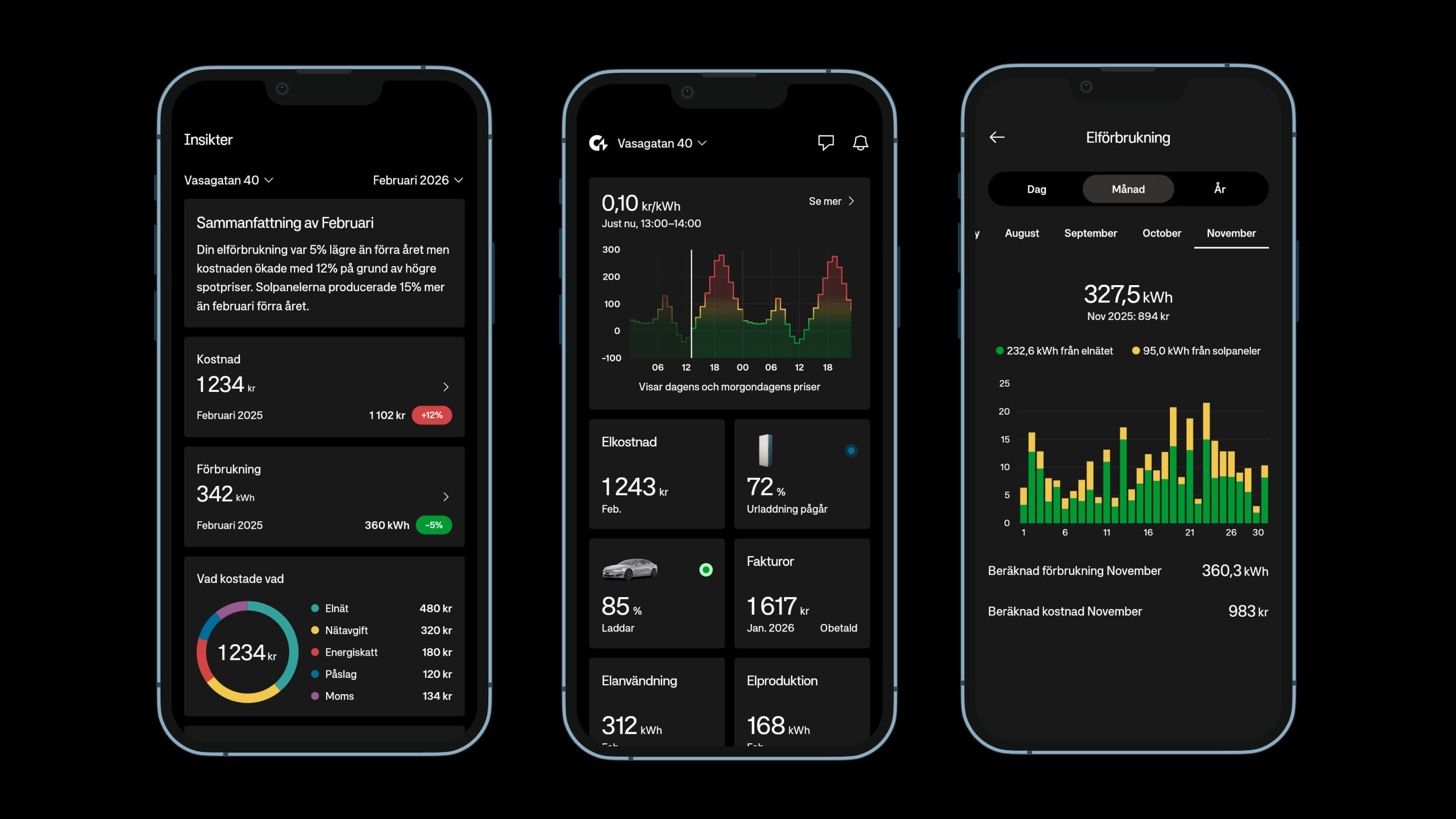
The focus was on making complex data simple. Energy pricing is confusing for most people. The app needed to be clear at glance and helping you do what you want with as few taps as possible.
A new way of working
This is where things got interesting.
Greenely had two separate codebases. One for iOS, one for Android. Every feature built twice. Every bug fixed twice. Testing everything twice or sometimes not at all. I encouraged them to consider a different approach.
We started migrating to Flutter, a cross-platform framework that lets you build once and run everywhere. But instead of the traditional workflow of designing in Figma and then handing off to developers, we tried something new.
Using Claude Code, I could now do something that wasn’t possible before: as a designer, I could actually build the components myself.
I built the entire design system directly in code using Widgetbook for Flutter. Buttons, colors, inputs, navigation, loading states, dark theme, haptics, animations. All of it. What used to take months took two days.

I also built a complete prototype of the app as an interactive web app using AI. Not static screens in Figma, but a working prototype to test flow and information architecture. You could tap through the entire experience. This made it possible to validate the design before writing a single line of production code.
For specific features, I prototyped interactions directly in code. Animations, transitions, micro-interactions. Things that are hard to convey in a design tool. Once the prototype felt right, the code could be refined and integrated into the real app.
The feedback loop became instant. No handoffs. No “this looks different from the design” conversations. Just real components running on real devices.
The result
A unified codebase. A modern design system. A faster way to iterate and ship.
Management expect that the migration will take a year. I believe it can be done in a fraction of that time while significantly improving the user experience along the way.
Working on this project made something clear to me. With the right setup and way of working, things can genuinely move ten times faster. Not a little faster. Ten times. At least.
This project also changed how I see my own role. I’m no longer just a designer who hands off work to developers. Using AI tools like Claude Code, I can go deeper. I can build the design system myself. Prototype real interactions. Ship components that actually work and in some cases the complete code. The gap between design intent and final product has essentially disappeared.
This is what’s possible when you combine modern AI tools with a willingness to rethink how products get built.
Brand implementation, app design, and design system by Glauser Creative.